All work
Client work
The Hope Bridge
Neutral, feminine identity system for a Dallas pregnancy resource center rooted in care, life, and hope.
Branding
Overview
The Hope Bridge walks with women, birth fathers, and unborn children through support services, classes, testing, ultrasounds, and counseling.
The identity needed to feel welcoming and calm while still carrying spiritual weight and organizational clarity.
Approach
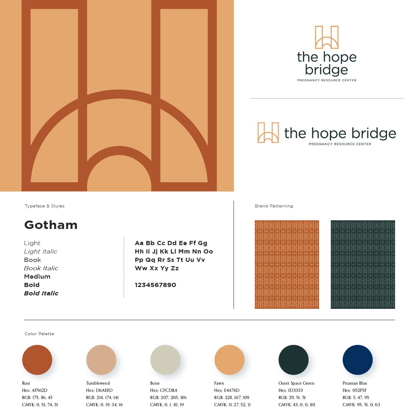
The mark plays with bridge typography and rainbow symbolism as a quiet signal of life, covenant, and moving from one place to another.
Guidelines locked the system for consistent nonprofit use across materials.
Gallery